
Link customization
By default, Link shows the Connector’s logo and Merge’s neutral chrome. With co-branding, your logo sits next to the Connector’s logo at the top of every Link step, so end users see your brand alongside the third party they’re authenticating to.
This page covers what’s configurable. For the broader Link integration flow, see Link.
Upload a logo
The logo is stored in Merge’s public media storage and served through the Link flow when co-branding is on. Re-uploading replaces the existing file.
You have to upload a logo before co-branding can be turned on - the toggle is disabled otherwise.
Enable co-branding
Same page. Toggle Co-branding, click Publish, confirm. Changes apply to new Link sessions immediately; existing Link windows aren’t refreshed.
When co-branding is on, the Connector setup screen renders a header with your logo, a divider, and the Connector’s logo:
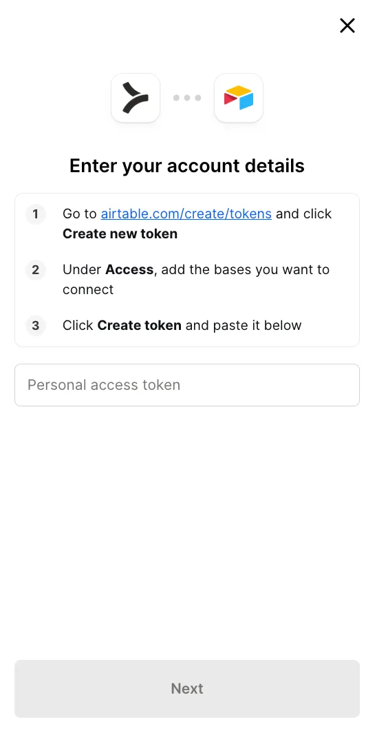
When it’s off (or no logo is uploaded), Link falls back to showing only the Connector logo.
Colors and shape
Custom colors and border radius are applied on the first rendered frame of the Link modal, so there’s no flash of default styling before your branding takes effect.
Configurable settings live on the Appearance tab:
- Primary button color, set as a hex value, for the button background.
- Primary button text color, the hex value for text on those buttons.
- Font, a web-safe font name applied across the Link flow.
- Border radius for primary buttons, selection buttons, and the Link modal, each set as a CSS value such as
12px,0.5em, or50%.
Changes apply to new Link sessions on save.
Restricting which Connectors appear
If you only want a subset of your Tool Pack’s Connectors visible in Link, configure the allow-list at Configure → Link → Authentication. Useful when the same Tool Pack drives two different Link surfaces and each should expose a different selection.
What end users see if you configure nothing
A neutral Merge-branded Link flow with the Connector’s logo, no co-branding. Functional but not in your visual identity. For most embedded products, customers expect to see your brand - turn co-branding on as part of your launch checklist.
Live preview
The configuration page has a live preview pane on the right. Changes are reflected as you type or upload, so you can iterate without saving and re-publishing each time. Click Publish when the preview matches what you want end users to see.
Next
Bring your own MCP server in as a Connector with Custom MCP servers.